Decorating baby nurseries can be stressful and exciting at the same time, especially when deciding on the room color and all the furniture to go with it. Charlotte Smith from At Charlotte’s House walks us through how to choose the perfect neutral palette for a baby boy’s nursery, and how to go about decorating the room. Read the blog to find out more!
Neutral Boys Nursery
When my friend pulled me aside and told me she had some exciting news…I couldn’t help but mentally fast forward to the nursery that I wanted to help her pull together! Thankfully her exciting news was in fact a baby on board, and when she found out she was expecting a boy a few weeks later… wheels started turning!
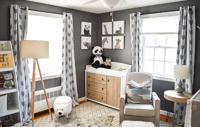
Her in-laws had already given the nursery a coat of Behr’s Iron Mountain gray and my friend is a self admitted color-phobe! Even with an essentially neutral palette we were able to bring in variations of color and pattern to make this space warm and cozy and I love it!

I started by looking for the larger pieces that would need to fit into the room: a changing table and a crib. This changing table with the wood tone finish was not only the perfect size but warmed up the space with the natural wood look.

We were able to find a wooden side table that matches that wood finish perfectly and tucks in beside the glider to hold a small gray table lamp. When baby gets a little more mobile, that lamp can be relocated, but for now it will hopefully be a soft light for midnight feedings or bedtime stories. The nursery isn’t a huge space so we opted for a more diminutive crib. Not only does it have clean lines, but it’s also lower than other cribs which is perfect for my friend who’s more petite.
A glider is also a nursery essential and this one is shockingly affordable for how luxe it looks. It’s also fairly small in stature which is far cry from the tank that I had in my first nursery. It tucks in next to the changing table perfectly, and with the black and white ottoman at its feet, hopefully will be a comfy spot for both mom and baby!

Moving onto the design of the space, my friend loved the idea of a vinyl tree! We selected this cute birch tree vinyl and kept it simple by leaving off the birds and leaves. To ensure proper adhesion, make sure to clean your walls first. Installing the vinyl couldn’t be easier and adds a wonderful graphic element to that corner.

I’ve always loved this assortment of baby animal photographs and when I included them in my initial vision board for the space, my friend LOVED them. That became a bit of our theme and we tried to bring in other baby animals where we could.


It’s a small detail, but I love this sweet bear wallpaper from Dwell that I put on the back of that kids bookshelf. Storage was important to my friend so the added toy bin on the bottom of this bookshelf was perfect. I also brought in that cute polar bear storage ottoman and can already picture the baby learning to stand on him!
The initial window treatment I picked for the space was a plain white with a tassel detail, but I’m so happy that was unavailable because these blackout curtains with the black arrow detail and those industrial curtain rods are such a perfect complement to the space.

My friend said she’d always wanted a faux shearling rug in her nursery so we layered that soft textured gray ‘sheepskin’ over that gently patterned rug. Again, the subtle pattern helps make the space feel more interesting and cozy than it might with a series of solid colors around the room.


If you can’t put an elephant laundry basket in the nursery, where can you? Also, that DIY name board with vintage flashcards adds a little bit of color. When the baby can stand, you can replace it with something softer!

My friend already had that wire shelving in her closet, but these gray storage bins provide lots of great storage for off size clothes, but also match the rest of the space so the closet will look nice even with the doors open!

I already mentioned that sweet gray table lamp, but the standing floor lamp is gorgeous and brings in the wood tones from the rest of the room. There is an overhead light in the space, but sometimes they can be a bit harsh so hopefully these will give the family some options!

I love how this space came together! It truly goes to show that even when a color story is fairly conservative, with the right balance of texture and pattern, a space can still feel cozy and warm and inviting!
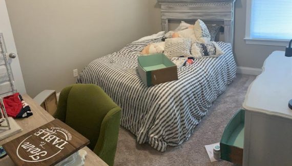
Just to show, here’s how the space looked when I arrived:

Feels so much bigger and brighter and inviting now!
Read The Home Depot Blog for more nursery ideas.
The post Neutral Boy’s Nursery appeared first on The Home Depot Blog.


No Responses Yet